Your Good Friend of Health Management.
Health Plans, Guides, Logs and Self-observations
Project Context
- UX Study Project
- Solo end-to-end designer: UX Research, UX / UI Design, Illustration
- Delivered by 4.5 months
Tools
- Ideation : Adobe Illustrator / Adobe XD / Keynote
- Prototyping : Adobe XD / Hand Sketch
- Research & Testing : Zoom /Google Meet /OptimalSort /Usability hub / Slack
Process
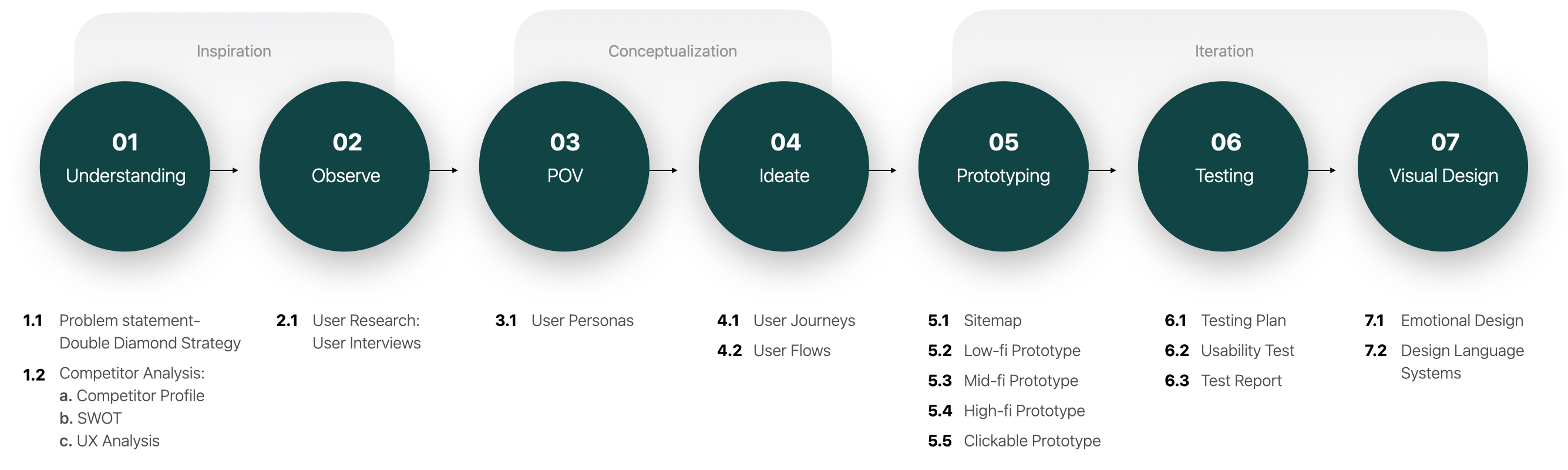

Inspiration
The Problem to Solve
What is the goal, What to achieve?

What problems are people facing?
- People’s health have deteriorated unknowingly, when noticed, the problem has already become serious.
- Strict dieting is very frustrating. People often stop dieting because they can’t stick to it, and give up dieting when they
see no results. - After some time, people can no longer remember the situation when the mild symptoms occurred and what are the possible behaviors related to/caused the problem.
- Recording the details of one’s life is a tedious task, the large amount of information is also difficult to organize.
- Modern life is very busy, When one’s mind occupied
with works, it is always easy to neglect self-care.
Problem Statement
Our users need a way to track their life style and health changes, get instructions to maintain well being in an easier way .
We will know this to be true when we see people are using the app:
- Make changes(big or small) in their lives and feel good about the new changes.
- Able to provide more complete, accurate changes in symptoms, health-related behavior, without struggle to remember during a doctor consultation.
Competitor on the Market
To find out the opportunities and make possible advantages
Objectives
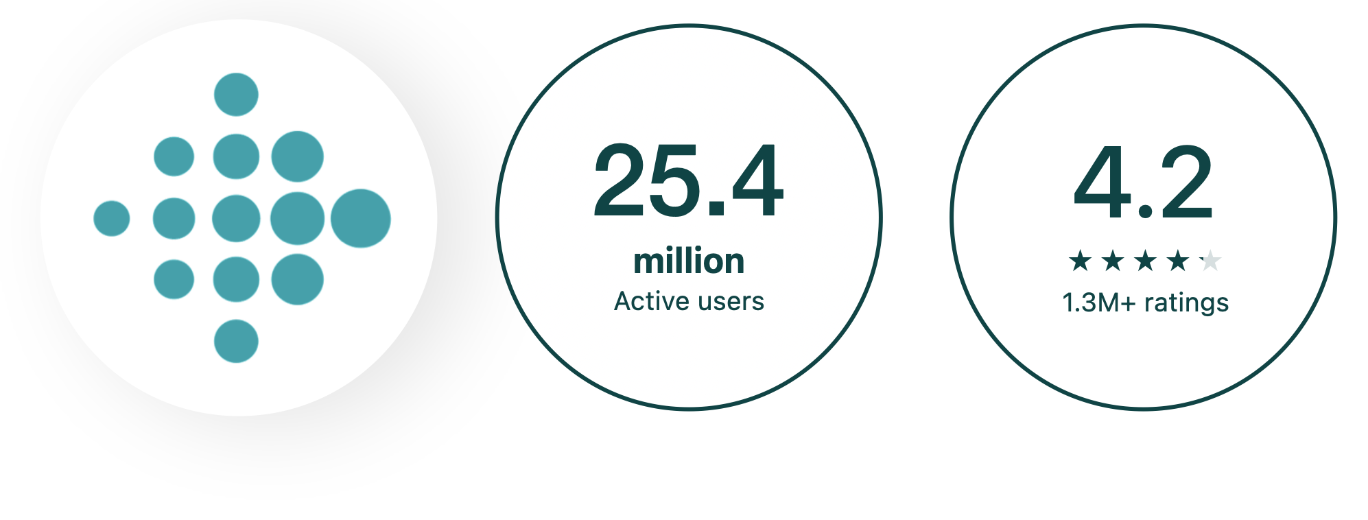
Fitbit: : Health & Fitness
- Accurate and detailed health-related data: measure hydration, logging food, activity tracking
- Motivated user by competition: allows users show their achievements and compete with friends who can complete the achievements faster.
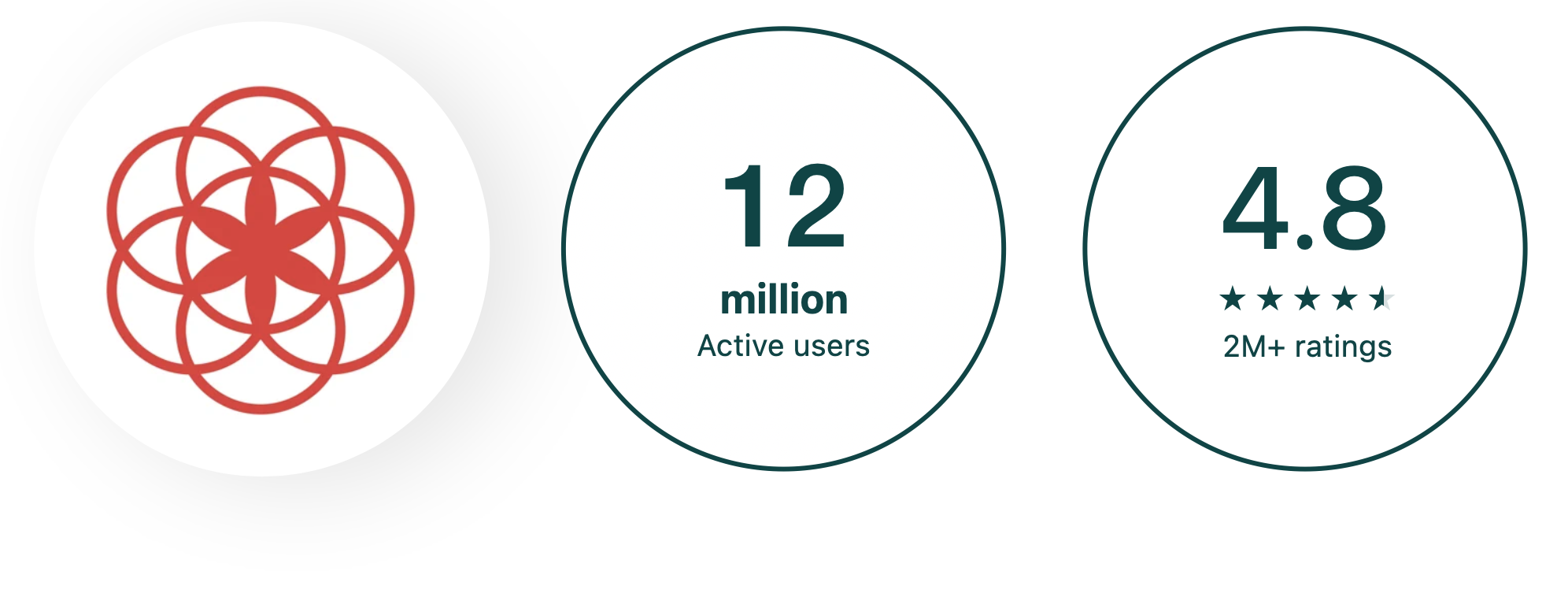
Clue Period & Cycle Tracker
- Provide 30+ tracking categories.
- Accurate period predictions for the next three cycle, boost fertility predictions.
- Learn more by tracking, start to live in sync with biology.
Summary
The main competitors are Fitbit, Clue, which are in the market leading position, these products provide record function, as well as food recipes, exercise videos. However, these products focus on one use goal (fitness, menstrual tracking) and show the following common points:
1. Simple functions with complicated steps.
2. Excluded other types of users,
Those defined an opportunity for my own product.
My product will be a mobile application that offer a holistic solution, it provides self-observation and activity management functions for all people who want to pursue a better life experience, improve their health / reduce disease risk. Different users can use it according to their own needs
After defining the problem and analyzing competitors, I have a basic concept of the product and developed a Business Requirement Document to start my development process.
Get to Know the User: User Research
Who will I design for, and what are their real needs?

Research Goals
User’s thoughts/behaviors on self-care
- User’s awareness of their own health.
- User’s health goals.
- User’s actual actions.
- User’s health problems, related experiences.
Possible factors that encourage/interfere user
- User’s awareness of their own health.
- User’s health goals.
- User’s actual actions.
- User’s health problems, related experiences.
Possible usage scenarios/tasks
When they plan to achieve their goals:
- The positive experience, the reason for the success?
- The negative experience, the reason for the failure?
Interference in the process?
User’s general thoughts/attitudes towards App
- Which apps do user enjoy using and why?
- What do users think about keeping records of
physiological conditions in the app?
Conduct Interviews
● According to my target audience in BRD, I conducted interviews with participants aged 25-35.
● These participants have different life styles but all have a desire to improve their health.
● 2/3 participants are using health management tools, but believe that they are not enough to meet needs.
Organize Data:
Affinity mapping
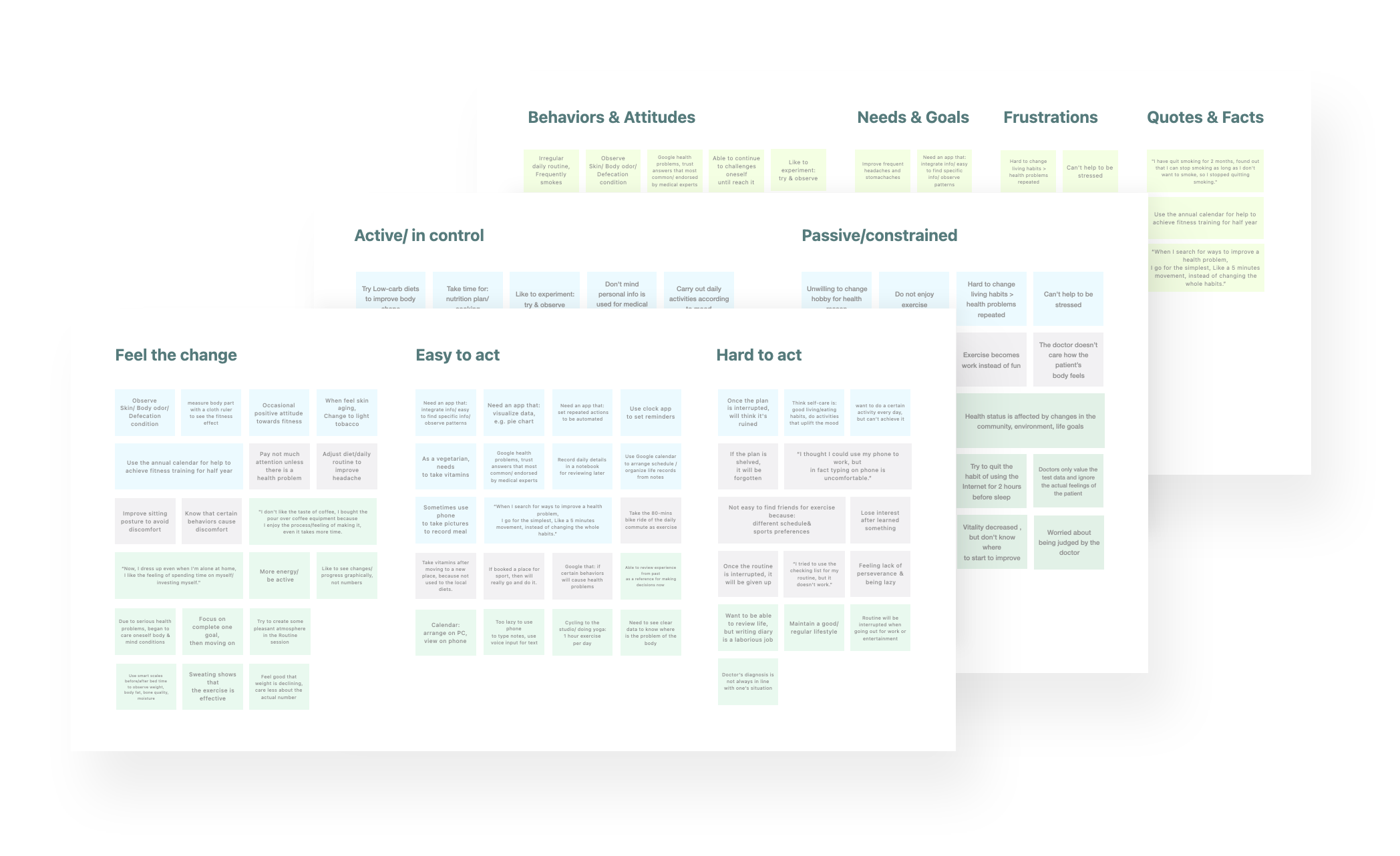
Lessons Learned
User’s thoughts/behaviors on self-care
- Users are aware of the general direction of maintaining health, but they do not implement it because they don’t know where to start.
- Users will adjust their living habits when they are unwell, but slowly return to the original mode.
- Users usually evaluate their health status by observing changes in their appearance.
- Users have the habit of taking vitamins and other nutritional supplements and products.
- Users have fun when they have new discoveries about their physical conditions and life patterns.
User’s seek medical experience/lifestyle
- Users are worried about being blamed for their health problems and frustrated about seeking medical assistance.
- In addition to medical professionals, users also value the experience of other people with similar conditions/symptoms in dealing with health problems.
- Not only medical skills, users also value the consultation process/doctor’s attitude, and think it’s not easy to find a suitable doctor.
- Users usually look for information on the internet before going to a doctor, trying to solve the problem by themselves.
- User’s routine will be interrupted due to changes in the environment and changes in life goals.
What encourage/interfere user for achieve goals
- The reason why user cannot complete their goal: 1. It cannot be sustained after being interrupted.
2. replaced by another higher priority goal and forgotten. - Users believe that combining health care behaviors with other goals and activities will strengthen action.
- Users need methods to measure results, but at the same time they don’t want to be over-compared to avoid frustration and pressure.
Users’ thoughts and needs for app
- Users want the App to have the function of data visualization, and think it helps them understand the information quickly.
- Users want the App to have customized functions, such as custom color classification boxes and information filters.
- When the private data taken by the App is meaningful to the user’s health/used for medical research or doctor’s diagnosis, they does not mind privacy issues.
- Compared with the data of physiological conditions, users are more reluctant to record their activities (places visited, songs they are listening to, etc.)
- Users are willing to share their own comments or thoughts on something to others, not their behavior.
- The user arranges the itinerary on the computer and uses the mobile phone to review.
- Compared with inputting text, users prefer to use mobile phones to save data by taking photos and voice input.
By collecting and analyzing the thoughts and habits of the participants, I was able to conceive the outline of the core functions of the product.
This will help me build Personas/User journey better in the next stage.

Conceptualization
Put Myself in User’s Shoes
See everyday life from the perspective of potential users
Personas
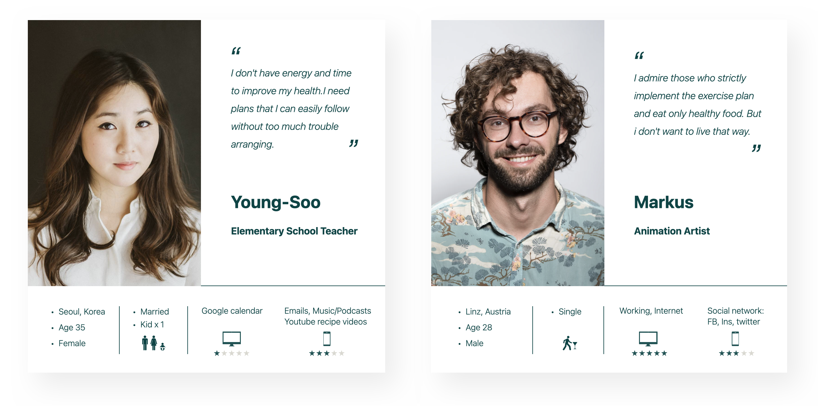
In order to better empathize with users and understand the difficulties they face. First, I created two primary personas, they are: Marcus who at the forefront of the target user age group. And Young-Soo, who has a stronger interest in self-care. In addition, to get a more comprehensive view, Henry the secondary persona whose age is 55-60, has been added. His needs and lifestyle are more different from the former two personas.
Visualize Tasks
Portray the specific problems and how potential users take action to complete the challenge
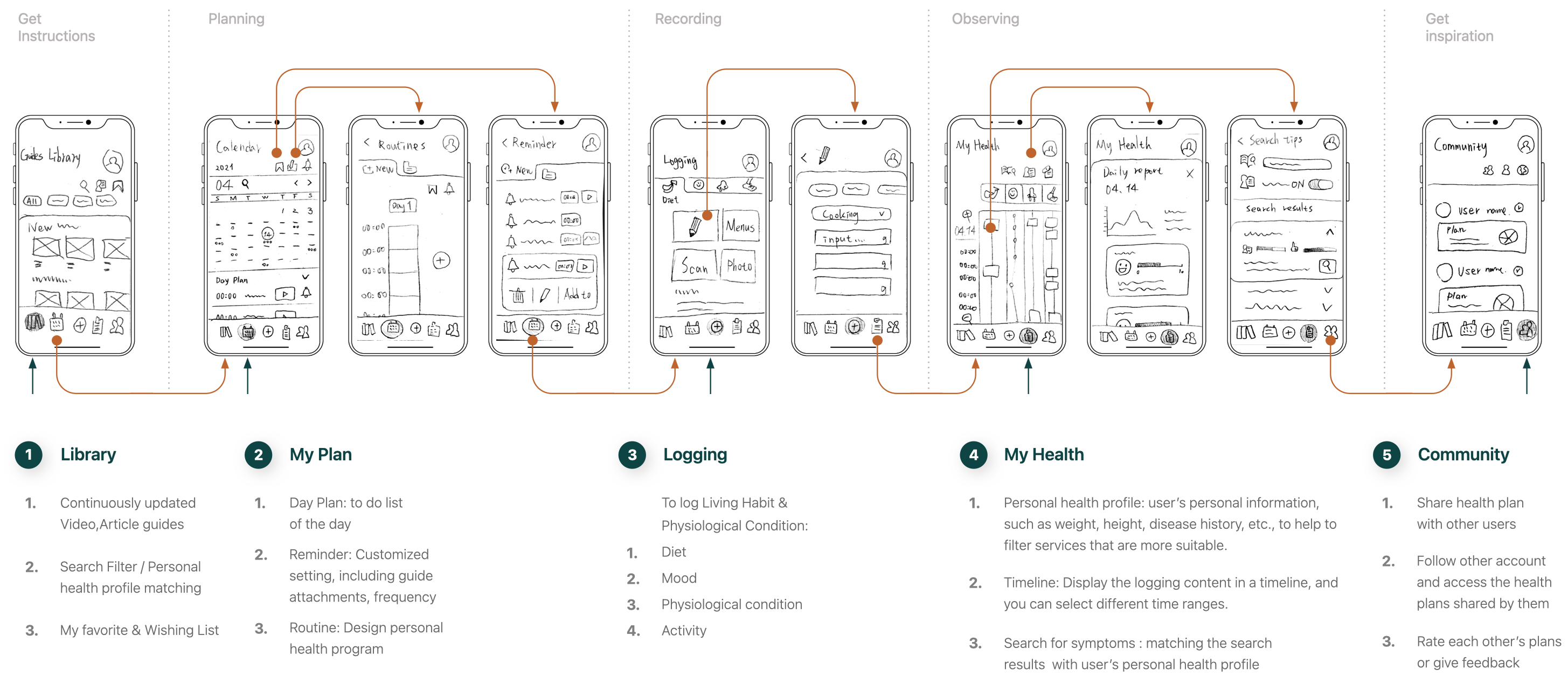
User Journey & Flow
After persona becomes lifelike, we can see their experience through their eyes and dig out problems. Through created the user journey, I accessed to the details of the persona’s life and have a deeper understanding of the user’s emotions, the issues that need to be dealt with.
Next, in order to build the foundation of the information architecture, I conducted a task analysis on the user journey, to map out the user flow, which shows how the user completes tasks to solve their problem. Then, iterate on the user flow to make it more reasonable and effective.
User Journey for Young-Soo

User Flow for Young-Soo
Key Objective
She has recently started to pay more attention to her health in order to maintain a better condition.She wants to record her daily diet, this way she can observe her own patterns.
Task Analysis
Entry Point: Dashboard
Success Criteria: Save the info of her meal.
Tasks
● Open Food Input
● Select input mode
● Select category
● Select menu
● Save data
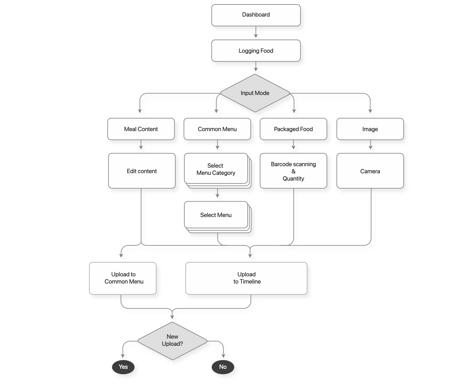

Iteration
Realize the Solution
Information architecture/Navigation and Product prototyping
Sitemap / Card Sorting
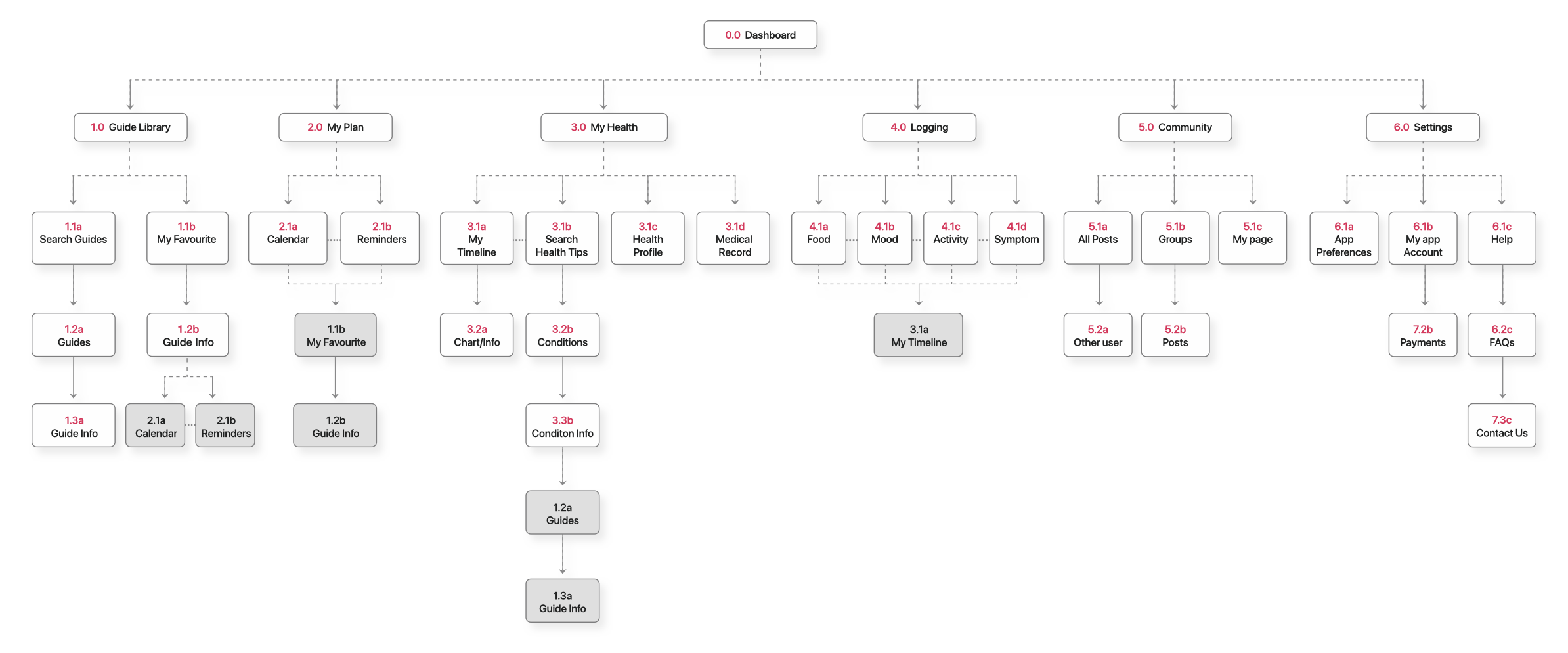
After having user flows developed for different features and purposes, I first organized them and constructed the initial site map.
Next, in order to eliminate blind spots and make the information architecture more in line with users’ actual views and behaviors, I invited participants of different cultural backgrounds and ages to perform an online card sorting based on the keywords of the sitemap. Their insights helped me improve the site map.
My goal here is to simplify the operation process as much as possible and make the logic of the structural in line with the user’s intuition.
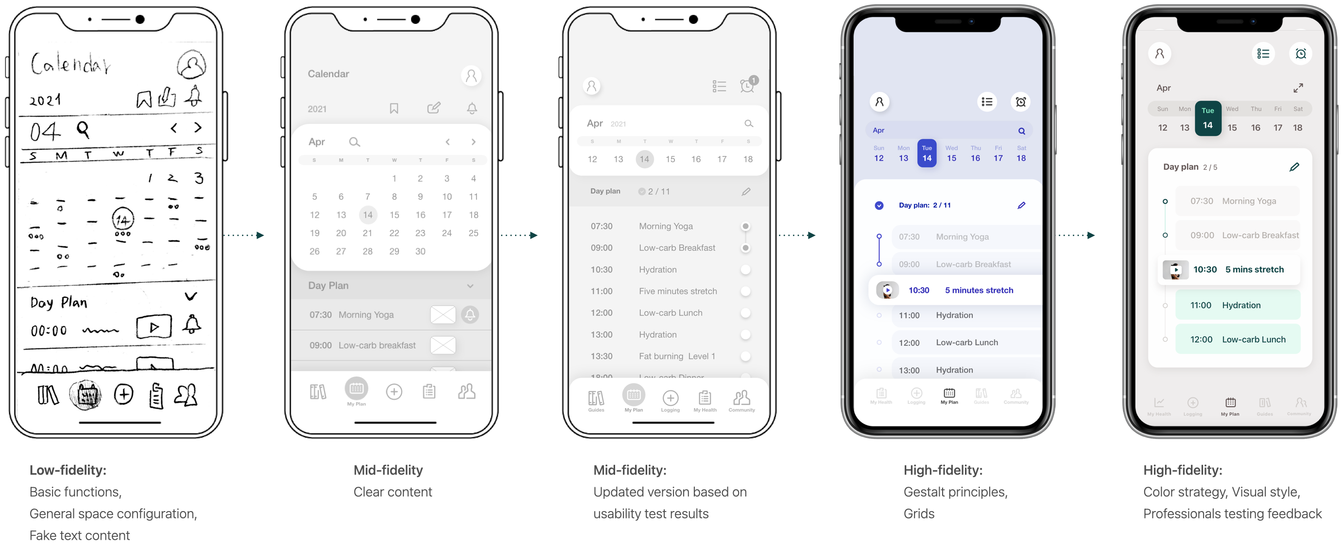
Navigation & Low-fidelity Prototype
First, I sketched the low-fidelity wireframe with pen and paper, which contains the main pages of the core features. At this stage,
I conceived the navigate menu, the draft content on each page, and the connection between them.
Before proceeding to the next step, I need to make sure that all important functions are covered and the navigation is easy to understand and intuitive.
Navigation / Low-fidelity_Mobile
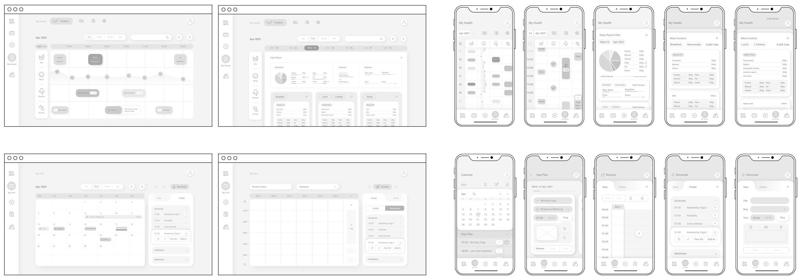
Mid-fidelity Prototype
Next, I created a mid-fidelity prototype on Adobe XD, modified the details and part of the structure of the low-fidelity prototype. When the key features can be displayed clearly and there is enough content for users to understand, It’s time to move on to the next step: the first user testing.
Mid-fidelity_ Desktop ← / → Mobile
Testing
To understand users thoughts about the design and make improvements
Usability Testing
Goal
The purpose of this testing is to evaluate the learnability, efficiency, satisfaction of the application, observe and measure whether users understand and agree with the functions of the application, and easily complete the initial core functions.
Overall
- 6 participants from: different cultures, locations /
age from 25 – 40. - Half of the participants are using more than one apps to maintain wellbeing
- All participants have a need to improve their health, 4 participants believe that their willingness is lowered due to many troubles in the act.
Test Results
● Five of the six participants agreed that they are satisfied with the features and usage of this prototype.
Users think that this product can be useful to them, and the current features meet their multiple needs,
which they can imagine using this product in their daily lives.
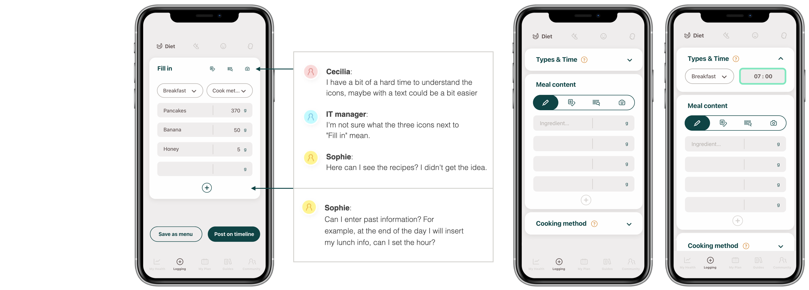
● This test has obtained very useful information, there are several important usability issues that need to be improved, here are key notes of this test :
1. Participants take longer time to complete the test task due to some misleading wording and icons
2. Due to the multiple features, users need onboarding, step by step guidance or explanatory labels to
quicker understanding on how to use the product.
3. Too many items on the 5-point scale cause the process to lengthen and reduce the concentration of
participants
Iterate
High-fidelity Prototype
After improving the Mid-fidelity prototype based on the feedback from user testing, I applied Gestalt principles, Grids(12 column) on High-fidelity Prototype, and developed color strategy, visual style to further make sure the prototype closer to the final product, which allows me to conduct another test that resemble to the actual interaction between users and products to improve user satisfaction, eliminate blind spots, and remove usability issues as much as possible.
Accessibility Improvement
Example:
1. Change the title of the block surface to make the main body clearer. 2. Separate the auxiliary input box and set a separate block, and set “drop up” as the initial state so that the user can focus on the main block
Prototype Iteration
Final Step
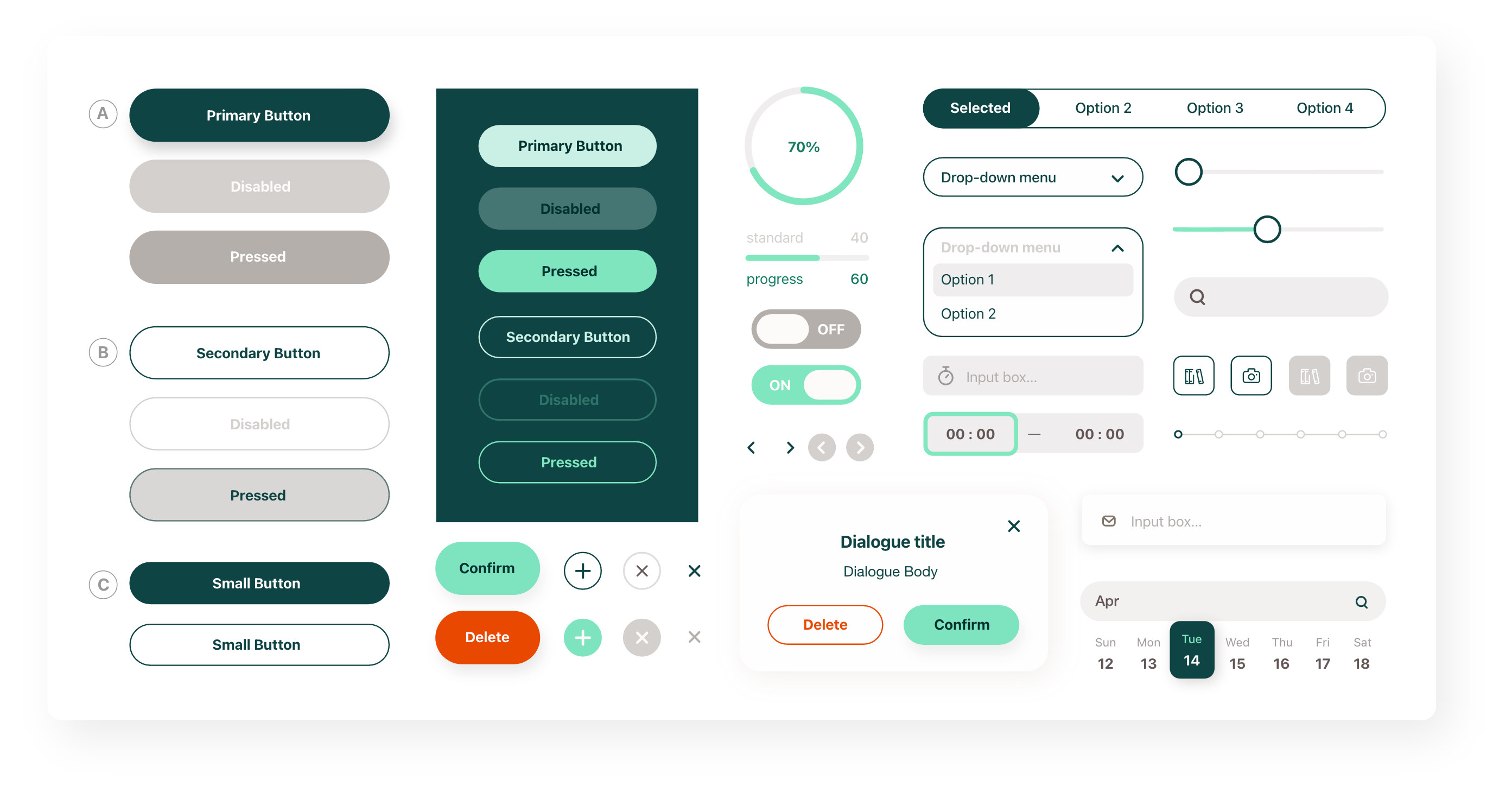
Design Language
To ensure consistency for the future of the product,
provide instructions to coworkers and developers
Visual Strategy
Use red orange, golden yellow, and olive green as brand colors to convey a sense of vitality, stability, and healing. To attract people who are pursuing a healthy lifestyle and seeking to improve their physical fitness or health problems.In order to establish long-term relationships with customers, we will develop a neutral, chic visual style for the target audience of 25-35 age group.

Design Language Document
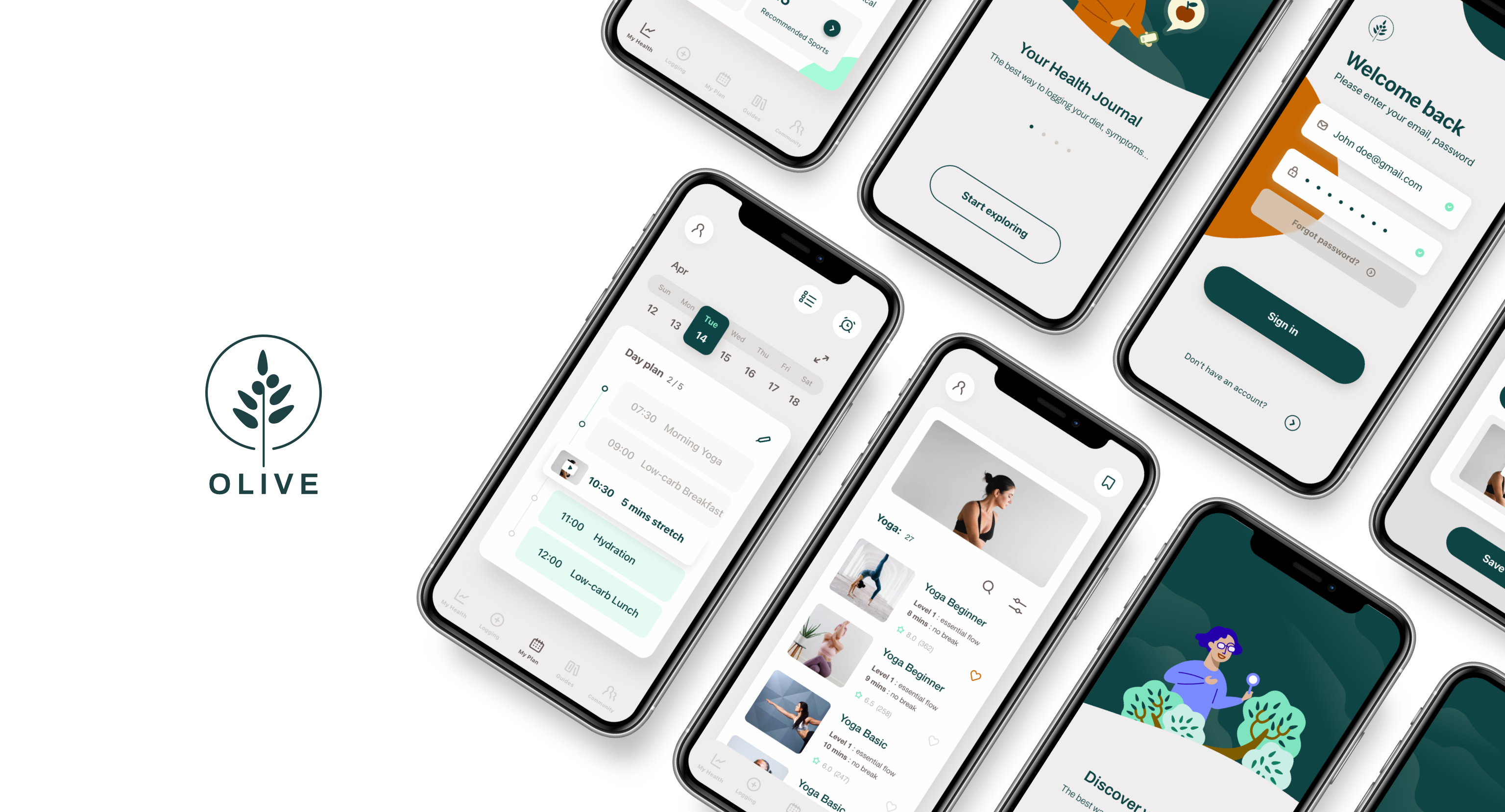
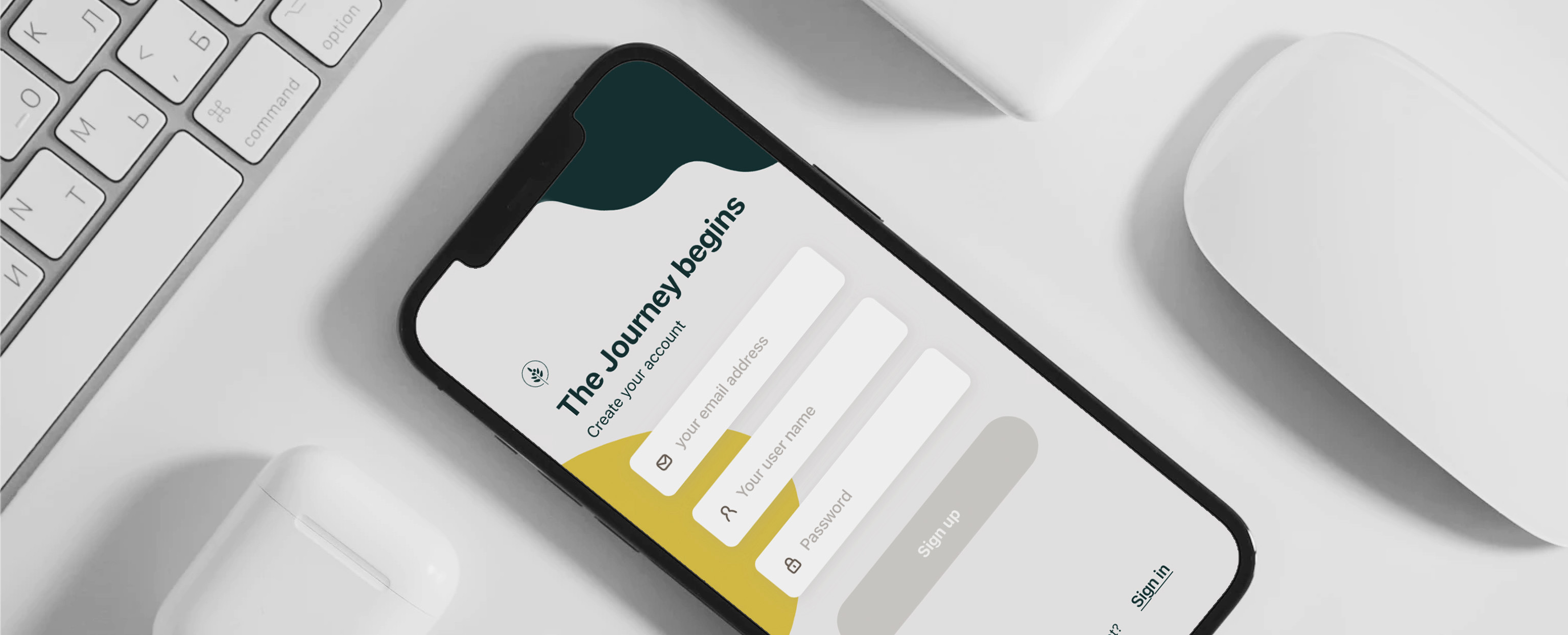
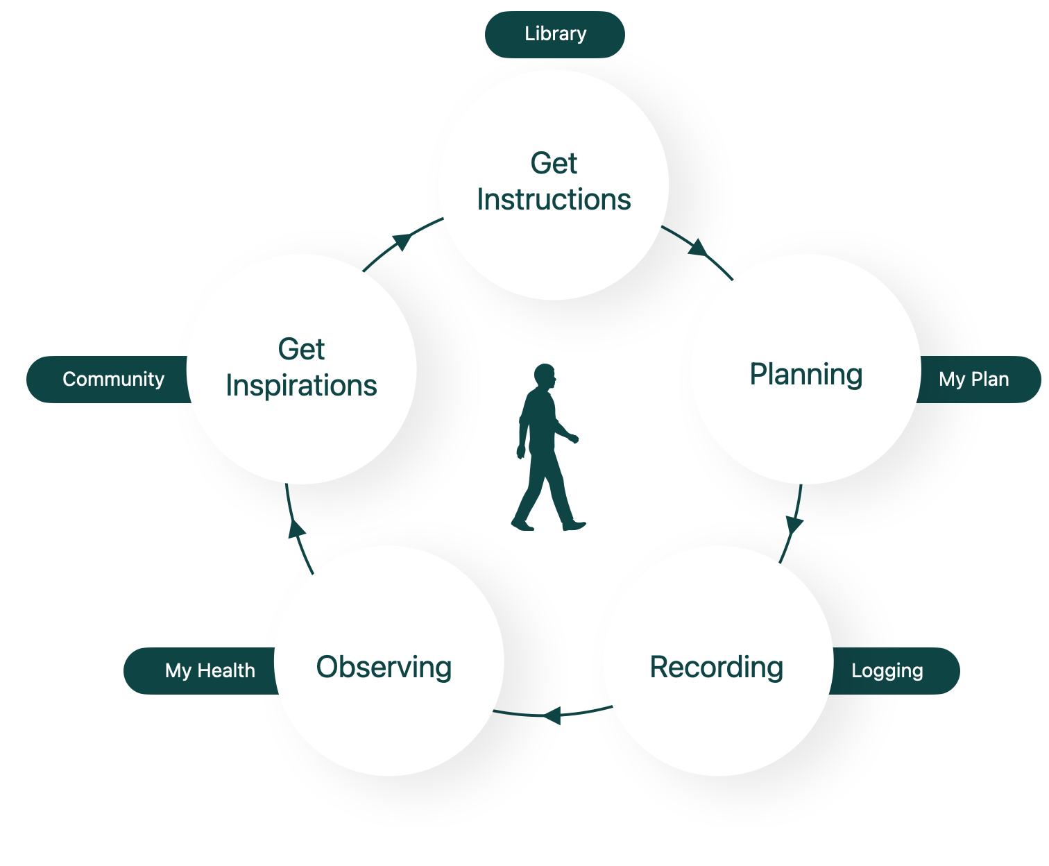
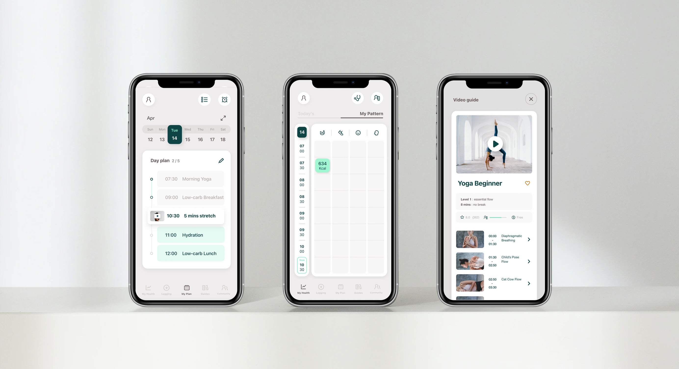
Final Product
My final product contains the core functions in the plan at the beginning. Users can easily implement self-care through logging, observations, and planning features. They can also use the filter’s personal health profile matching function to get health guides that is more in line with their own conditions. This is a complete health management program. Users can Long-term use and meet the needs of different goals and different periods
Retrospective
What I learned
Work Arrangement
Strengthen the focus for different purposes at different stages in the design process. For example, in the part of conceiving functions, it should take a longer time to develop sketches of different concepts, and then get the best choice from them/improve or merge the advantages of different solutions. Avoid being distracted by visual details
Method of decision making
Make good use of pros and cons analysis to help design decisions. Although sometimes intuition may be a useful tool, a quick Pros and Cons analysis or Challenge Solution Benefit analysis can help shorten the time spent in hesitation, and can view the situation in a more objective way, providing a more comprehensive and reasonable answer.
The value of user research
User research is not only about understanding the needs of users and who they are. Good user research inspire unexpected creativity and much more effective solutions.
What can be improved
Where
I believe that my app would be improved by a more effective onboarding, The guidance dialog box for each feature needs to be matched with details, including small prompt labels that explaining tools button, and explain to the user that even if they close the guidance dialog box, they can still find the function teaching in the account setting area.
How
I will conduct faster, effective user testing such as AB testing to help improve more details and ensure the smoothness of functions operating, and increase the professionalism of the product. Also, enhance the sense of value presented by the appearance of the product.
New hypotheses
Problem Statement
When users plan, execute diet and fitness plans, they want tools that simplify the process as much as possible.
Hypothesis
After users have set health goals, they can filter out suitable health guides. Therefore, they also need a calculation function that can list the total required equipment, ingredients, which can increase their willingness to execute the plan.
How will these hypotheses be validated?
Develop an MVP for fitness and dieting guidelines with this feature, and invite potential users (those with relevant experience) to test, observe the implementation of the participant’s health plan (willingness to execute, progress of completion), and collect the participants’ comments on this feature
– end –
